Mountain Valley Therapy
Physical Therapy Clinic Website Design, SEO and Copywriting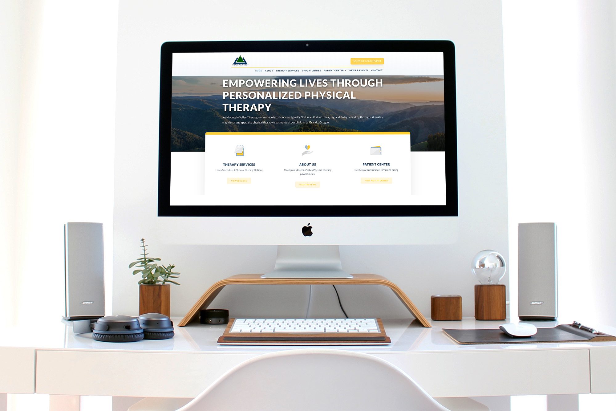
Clean, Customer-Focused Design
One part gym, one part therapy clinic, one part holistic health center and all-parts awesome, the team at Mountain Valley Therapy is really the full package when it comes to taking care of people’s well-being.
Mountain Valley Therapy wanted a site that would be optimized for conversions and showcase the essence of who they are and what makes their therapy unique.
There were two things they really wanted to highlight: 1) Their mission to glorify God and 2) the personalized nature of their therapy. There are no “molds” or “programs” they try to shove everybody into, and they wanted to highlight this to really show the value a client can receive.
So the goal I had in redesigning their site was to make their web-presence as personalized and Christ-centered as their real-life practice is.
When I redesign a site, it’s important to me to spend as much time as I can getting to know the company and really digging into what’s going to get them results. I often have as many as 5 or 6 meetings with a prospective client before they sign the paperwork for the site.
This is important because these meetings allow me to learn a ton about the company so that I can write with the personality and depth that represents a company’s brand voice. It gives it an authentic, real feel that draws people in and makes them want to connect with the company.

Project Completion Date
April 1st, 2018

Location
La Grande, OR

Skills Needed
SEO, Copywriting, Web Design, WordPress

Tech Stack
WordPress
That covers the content….but what about the design?
On this site, I decided to use a shorter homepage. Rather than make the entire case on the homepage for why someone should choose Mountain Valley, I thought it was more important for users to be directed to the specific services they were interested in. The services provided at Mountain Valley are pretty diverse, after all.
The Mountain Valley site differs from many sites I create in that it is more customer service driven rather than purely a lead-generation website. The patient center is where patients need to download forms, pay their bills, and learn what to expect from their first visit. And they need to be able to do this whether they are web-savvy or not. For this reason, I really wanted the patient center to be easy to navigate and intuitive.
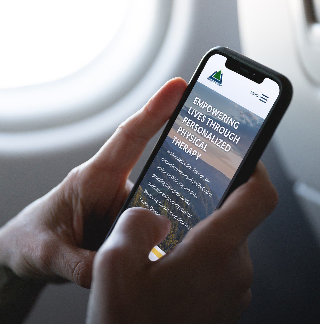
Because Mountain Valley often has a large caseload of older clients, I chose a larger header and menu, and used larger fonts throughout the site. This proves that websites can still look good without having to sacrifice readability or user experience.
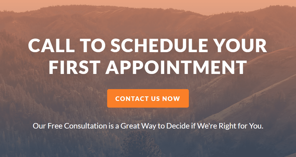
The All-Important CTA
For the call-to-action, I really wanted to stick to one CTA per page to avoid any confusion. We chose to use a CTA that guides the visitor to schedule an appointment on pages which were geared towards new client. On pages that appealed more to existing clients, we used an email optin that would ultimately be used to keep Mountain Valley’s clientele up to speed on news and events. Both CTAs look pretty great, in my humble opinion.
Mountain Valley Therapy was a great client to work with because of how confident they are in their mission and values. It was great to work with them and see behind the fold of such a cool, Christ-based group! And I’m proud of the website we designed for them because I think it accurately represents the quality, personality, and Christ-centered attitude of the people behind the scenes.
That covers the content….but what about the design?
On this site, I decided to use a shorter homepage. Rather than make the entire case on the homepage for why someone should choose Mountain Valley, I thought it was more important for users to be directed to the specific services they were interested in. The services provided at Mountain Valley are pretty diverse, after all.
The Mountain Valley site differs from many sites I create in that it is more customer service driven rather than purely a lead-generation website. The patient center is where patients need to download forms, pay their bills, and learn what to expect from their first visit. And they need to be able to do this whether they are web-savvy or not. For this reason, I really wanted the patient center to be easy to navigate and intuitive.
Because Mountain Valley often has a large caseload of older clients, I chose a larger header and menu, and used larger fonts throughout the site. This proves that websites can still look good without having to sacrifice readability or user experience.
For the call-to-action, I really wanted to stick to one CTA per page to avoid any confusion. We chose to use a CTA that guides the visitor to schedule an appointment on pages which were geared towards new client. On pages that appealed more to existing clients, we used an email optin that would ultimately be used to keep Mountain Valley’s clientele up to speed on news and events. Both CTAs look pretty great, in my humble opinion.
Mountain Valley Therapy was a great client to work with because of how confident they are in their mission and values. It was great to work with them and see behind the fold of such a cool, Christ-based group! And I’m proud of the website we designed for them because I think it accurately represents the quality, personality, and Christ-centered attitude of the people behind the scenes.

Get a Site Like This
Want to partner with us to create a site that’s both beautiful and functional? Book a discovery call with Matt so we can learn the needs of your business.